QA Nightmare in Unity: 8 Accessibility Fails I Created ♿
— An exercise in empathetic debugging.
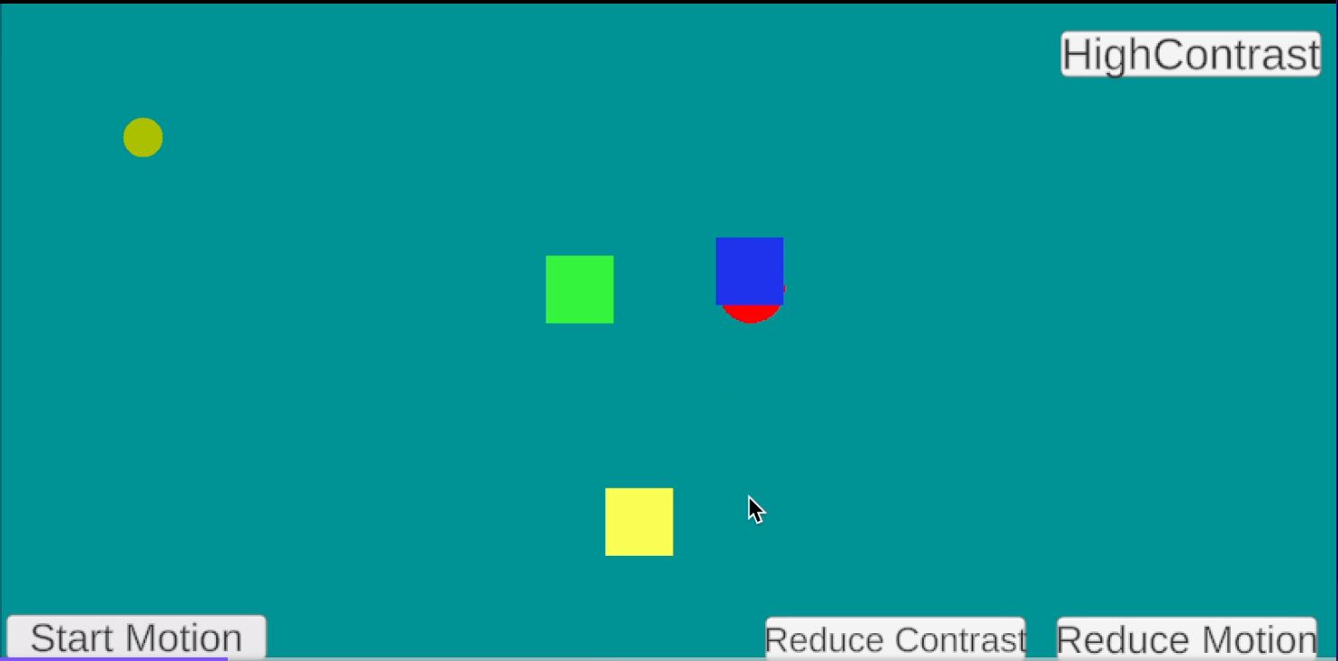
I wanted to understand how players with ADHD, color-blindness, or cognitive sensitivities experience unpredictable motion. So I built a Unity demo with four accessibility buttons:
- 🟢 Start/Pause Motion
- ⚫ High Contrast
- ⚪ Reduce Contrast
- 🔵 Reduce Motion
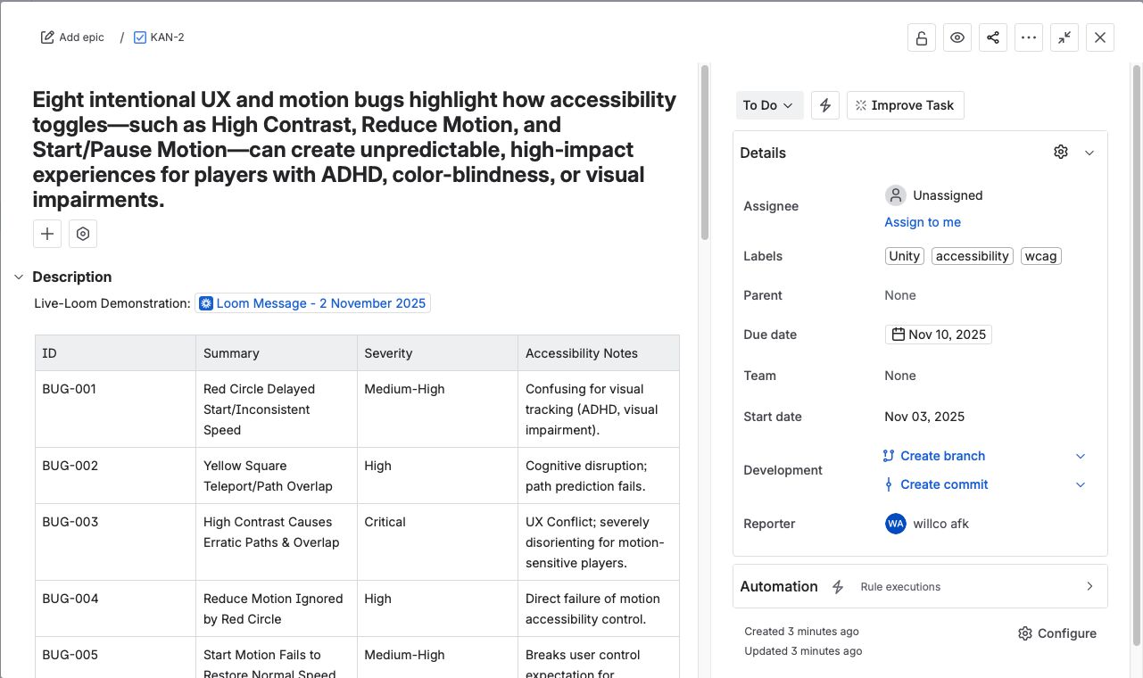
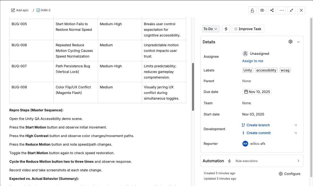
Each toggle triggers intentional UX and accessibility failures — erratic motion, teleporting shapes, inconsistent speeds — to simulate how asynchronous states and random vectors can destabilize gameplay for players relying on accessibility features.
🧠 The Insight: QA isn’t just functional — it’s empathetic. 'Start, pause, or stop motion' features can make or break accessibility across PC, console, and web.
💬 Curious what accessibility features you’ve seen most often ignored in modern games?
🎥 Demo + JIRA + gameplay links in the comments ↓
Project Screenshots


